LOGO
THE COMPANY PROJECT
In 2017, The Company Project was a new dance studio opening in Pantego, TX. The owner and creative director, Joe Berry, wanted a brand that signified elite performance and royalty, as his vast experience as a dancer and choreography had produced many top-scoring competitors, title-holders, pageant queens and working dancers. We agreed upon the key colors of purple and gold, and I created a brand palette that felt modern and fabulous at the same time. The logo needed to represent dance and the full studio name overtly and prominently, in order to drive enrollment from local parents driving by the strip mall signs.

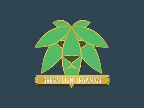
GREEN LION ORGANICS
Breaking into a newly opened Oklahoma market in 2020, Green Lion Organics was looking for a logo that could help them stand out among a collection of farms with no clear market shares. They wanted to communicate a sense of maturity and quality to reflect the Head Grower’s depth of experience in the more established California market. This direction included a request to make the product symbolism cleverly subdued or abstract. I selected a brand palette that emulated a mid-century smokers lounge along with typography and shapes reminiscent of art deco and apothecary—an overall feeling of a timeless “cool factor”.